Disclaimers:
There are a couple of important things to be aware of when you have specific colour requirements:
1. Customer Approval
If a demo is approved with Pantone references (whether supplied by you, or picked by us), we will assume you’ve either checked the colour against a physical guide, or accept our discretion when choosing for you. We can only accept responsibility for printing the colours approved.
2. Discharge Inks
A slight degree of variation from the target colour must be accepted for discharge printed orders. The nature of discharge printing means there are sometimes unpredictable factors. For example, it is possible for a product that is normally reliable for discharge printing, to have a dye batch that does not discharge as effectively. This may affect the final print colour, which cannot be known until the t shirts have been printed (at which point, it can no longer be changed).
What We Can Accurately Match
To accurately colour match ink colours for your order, we need to be supplied with suitable Pantones (that have been chosen from a physical book) or sent physical reference for us to match against.

What are Pantones?
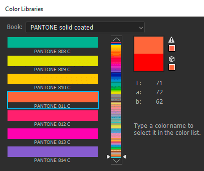
These are also often referred to as PMS colours, which stands for ‘Pantone Matching System’. Pantone has come to be considered the standard for colour matching systems, in many printing industries. There are thousands of Pantone colours, with each colour being identified by a unique number (such as ‘2010 C’ – see image above).
Pantone matching requires both the client (or designer) and the printer to have physical copies of the same Pantone book. This way they can be sure they are both looking at exactly the same real world colour, and the product can be printed exactly to specification.
Pantone Books We Use
For screen printing, we can only accurately match colours to the following books:
- Solid Coated Pantones
- Solid Uncoated Pantones
These are the only books we have on premises and use daily. We cannot use references from Pantone books outside of these.

Pantone Solid Coated matching for 2010 C.
Buying Pantone Books
The downside to Pantone matching is that the books are quite expensive. Which doesn’t make them very economical for infrequent use, especially as the books can fade over time (Pantone actually recommend replacing books every 12-18 months). It is possible to find lower prices away from Pantone’s website. The Solid Coated Pantone books tend to come paired with the Uncoated book. If you shop around, you can often find the books sold individually on Ebay for around £60.
Please remember we can only use references from Solid Coated or Solid Uncoated books.
If Pantones Aren’t an Option
If getting hold of a Pantone book isn’t an option, another option is to send us a physical example of colour (such as a previously printed t shirt, or piece of branding material for example). We will use our own Pantone guide to match against what you send, and eliminates the margin of error when choosing from a monitor. This Pantone will be added to your demo artwork for future reference.
What We Can’t Accurately Match
We only accept Solid Coated/Uncoated Pantones (or physical reference) for accurate matching. Below are examples of codes we cannot accurately match ink colours to, but are often asked about.
- TCX Pantones (or other Pantones that aren’t Solid Coated or Solid Uncoated)
- RGB or Hex Codes (e.g. #340349)
- On-Screen Image Swatches
- CMYK Images
TCX / Other Non-Solid PMS References
We are occasionally given TCX Pantone references by customers. TCX stands for ‘Textile Cotton Extended Range’. Although they do refer to textiles, these are not the Pantones we work with. There are a handful of other Pantone books that exist too, but when mixing ink colours for screen printing, we only use colours from Solid Coated or Solid Uncoated books.
RGB/HEX Code Values
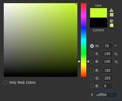
These are screen based colour values, which are frequently used for web design. These aren’t appropriate for two big reasons. Firstly, they have a much wider gamut of colours, because screens are back lit. They can achieve much brighter and vibrant results than anything in the real world. Secondly, computer screens are not calibrated to show colours accurately. What you may see on your own monitor, is likely to be different on another screen. Therefore, these values are not reliable.

RGB/HEX colour picking in Photoshop.
This is also why even the colour visuals we provide on our own artwork proofs should only be considered approximate. The only way to truly verify the colours, is by referring to the Pantone numbers specified on the artwork proof by using a physical reference guide.
On-Screen Images / Swatches
Images and other on-screen visual representations of colour cannot be used to accurately match ink colours. This for the same reasons outlined for RGB/HEX codes (see above), since all on screen images are currently generated by RGB monitors.
CMYK Images
It’s less likely that you would provide CMYK values, but the CMYK images themselves for us to use. These are made from values of Cyan, Magenta, Yellow and Black. Since these images (and others which have a lot of tonal variation) are made up from a limited pallet of colours, they have to simulate required colours using a blend of themselves. This is done using halftones – small dots that are arranged in angled overlapping patterns, which are only visible on very close inspection.
These type of images have too many variables to ensure exact colour accuracy, and may even have a degree of colour variation during a print run.
Using Pantone Converters
Online and software converters do exist, however they are not reliable. Screen colours outside the gamut of print will become muted, as they have to be adjusted to something within range. We have found Photoshop can produce some incredibly inaccurate conversions. Even if they were accurate conversions – you can’t be sure that your own monitor was calibrated to show the original value correctly.

Photoshop will often translate vibrant ink colours to one of a limited range of Fluro Pantones.
What Happens If Suitable Reference Isn’t Supplied?
If neither providing a Pantone or physical reference is possible, we will have to make a Pantone selection based on the artwork as it appears on our monitors. Although we will try to be as accurate as possible, this can only be approximate. We will only accept responsibility for printing the colour approved on the demo, not choosing of the colour itself.
That said, majority of our orders do have the colours picked by us, using monitor reference and is rarely an issue. So if you don’t have Pantones, don’t panic.
Inside Neck Print Colours
If you’re having inside neck printing with your order, you may find the ink colour has been put down on your art proof as Cool Gray 6 C (unless discussed otherwise). This is our recommendation for most inside neck prints, although it is possible to choose other colours.
Please visit our inside neck printing file prep page for more info on choosing neck print colours.
