Recommended File Setup
During preparation for digital printing, we recommend using the settings below:
File Type: .png with transparent backgroundResolution: 300dpi+ (up to 600dpi)
File Dimensions: Exact size for printColour Mode: RGB
File Formats
Digital printing is very flexible on what image file type you can supply. However, we recommend supplying .png files with a transparent background. This ensures that there are no hidden elements and fonts do not require outlining / rasterising.
We accept these file formats: .png .psd, .ai, .tiff, .jpg, .pdf, .eps, .svg
Print Colours
Unlike screen printing, digital printing does not have inks mixed to specification. Instead, it works much like a home paper printer, where you make whole colour spectrum from just 4 inks (CMYK). That’s short for Cyan, Magenta, Yellow and Black (black is referred to as ‘key’). We will include a white ink when printing onto coloured or dark t shirts.
It is not necessary (nor recommended) to supply art as CMYK. Please supply as RGB.

Tiger by Jack Teagle
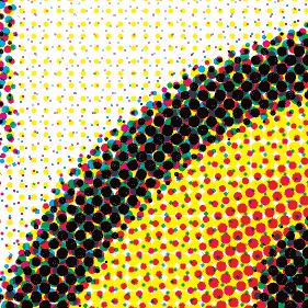
Example of how the eye may look, close up
Printing with CMYK means there are no limitations to colour variations or gradients within the design. A full colour photo print may be the same price as a ‘single colour’ print. However, you are only simulating colours outside of CMYK and White. Therefore, colours will not be as vibrant as they can be for screen printing. For this reason, we cannot guarantee exact colour matching. Specialist inks such as metallic or neon, are also not available for DTG.
We do not offer Pantone Matching for digital printing orders.
Getting The Best From Your Art
There are some additional steps you can take to improve the results of your digital prints. Some of these steps may not be necessary, as we find digital printing can be generally pretty forgiving. That said, it doesn’t hurt to be aware of them for in preparation for digital printing.
Scaling Up
If the original / best version of a file you have isn’t large enough, it will require scaling. Scaling up is one of the primary causes for degraded image quality. When you scale an image up, it generates potentially thousands of new pixels between the existing ones. Software has to ‘decide’ what image data is missing. The term for this is resampling.
Not All Upscaling is Equal
The results of upscaling can vary greatly, between different software packages and resampling methods. However, ultimately a lack of initial image data (because the image started too small) will be the main cause for degradation. The software is just having to ‘guess’ what is missing.
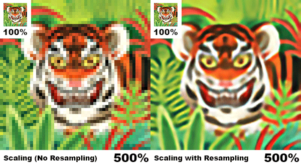
An extreme example of upscaling a small thumbnail image to 5x size

Quality of the image if starting from a higher resolution original image.
The example above shows what happens when scaling up a small thumbnail image by 500%. Firstly without any resampling (the pixels are just made larger). Then a version with resampling – you can see the compromises the resampling has to make, distorting the image. Finally, a version where the initial image was the correct resolution and required no rescaling.
The comparison above is an extreme example. However, it can be a realistic representation of what can happen to smaller elements within a detailed design.
Upscaling issues only apply to raster files – vector files can be scaled without quality loss.
The Best Approach to Upscaling
In our opinion, the best approach right now is using Photoshop’s Preserve Details 2.0 resampling. It’s much more advanced than the other options, and give you a little extra control too. It works particularly well for solid areas, which you can then sharpen to improve them further (see Sharpening Edges).
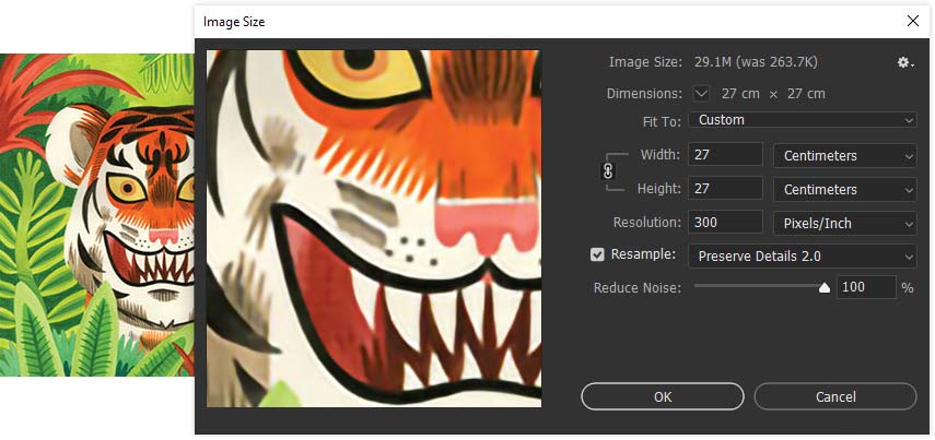
Image Size Panel (CTRL + I): Resampling Method – Preserve Details 2.0
This Resampling option has been available since Photoshop CC 2018. If you can’t see it as an option, check it is enabled in the Technology Previews.
If You Don’t Have Photoshop
If Photoshop isn’t an option, there are a number of image upscaling alternatives online you can try. With the increasing availability of AI driven software, upscaling is certainly a more viable option than it used to be. However, nothing beats having the original file as a high resolution image.
We will always try to get the best from your art file. However, we cannot take responsibility for poor quality images – regardless of methods used / available for upscaling.
Clean Edges
If your art contains hard edges (like those for text elements), it’s a good idea to make sure they are not anti-aliased. This is because when printing edges, any slight tonal variation will add or alter an existing halftone. With digital printing, this can result in edges that appear a bit soft or ‘furry’, rather than crisp.
Take a look at the comparison below.
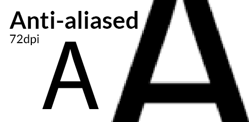
Anti-aliasing can lead to furry edges
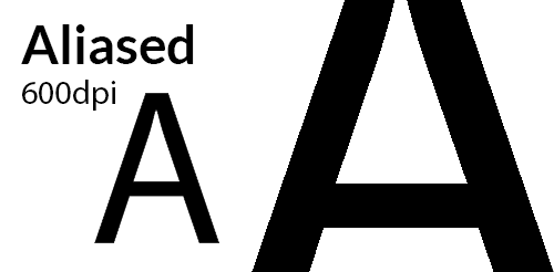
Aliased combined with higher DPI for best prints
How to Sharpen Edges In Your Existing Digital Art
If the art was created from scratch at print size and at least 300DPI – this possibly isn’t necessary to fix. However, if the art has generated additional anti-aliasing through rescaling or compression, it’s probably worth addressing. Depending on the complexity of your art, this may require getting your hands a bit dirty.
Set the Correct Size and Resolution
If replacing with vectors isn’t an option, then first make sure the artwork is exactly the print size you require and at least 300dpi. We recommend going to 600dpi at this stage, for cleaner ‘re-aliasing’.
You’ll then need to isolate the elements you wish to sharpen. These should be converted to black with a white background. You can then use the Curves (Ctrl + M) adjustment with the setting below.
Use Curves to ‘Re-Alias’ Your Hard Edges
Curves (Ctrl + M) adjustment with the setting below.
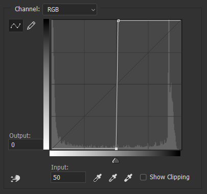
Adjust Curves to remove anti-aliasing
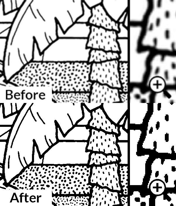
Before and After Adjusting Curves (Close Up on Right)
These edges may appear ‘jaggy’ when zoomed in, but if the image has enough fidelity they will look clean and sharp on print. We use this approach all the time for our screen printing, once print size has been confirmed. Using a high resolution image is essential. This is also a destructive step – rescaling the art after this point will be even worse than normal. So keep a backup of the original, incase you need to make changes.
After the Curves, reapply the original colour. Just be sure your method of reapplying colour doesn’t apply its own fresh anti-aliasing (else it would defeat the point).
Sharpening edges is not always an essential step. The need for it can be circumstantial. Some art we receive has such heavy anti-aliasing that it already appears blurry on screen when we receive it.
If you are providing vector artwork, this isn’t relevant. The edges will already be sharp.
