
Dark vs Light Coloured Products
Printing onto coloured or dark t shirts tend to be more expensive than white t shirts. This is for two reasons. There is an additional cost in the garment itself (because white/undyed is cheaper).
Secondly, coloured t shirts require additional setup if you decide to print lighter ink colours onto them. This is because light ink colours require an extra screen for an underbase. An underbase acts as a base coat, to make sure top colours come up bright.
Reducing Your Costs
If price is a primary concern, the most cost effective options are either:
Printing White T Shirts
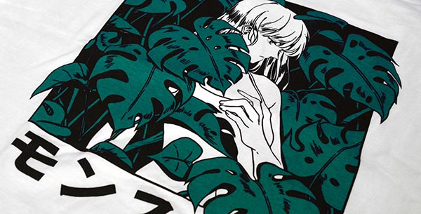
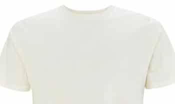
Julia Wei – printed on white t shirts.
This is the most cost effective option. White t shirts tend to be cheaper than coloured ones. Printing with standard water based inks is also possible. This is because white t shirts do not require an underbase or discharge.
It’s worth noting that we will upgrade GD01 white t shirts to their premium equivalent (GD15), free of charge.
Cheaper t shirts. Does not require an underbase or discharge.Printing With Dark Inks Only
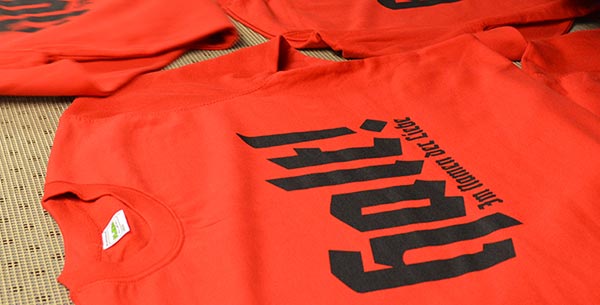
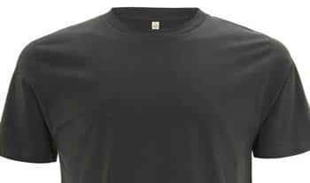
House of Voltaire – printed using dark inks.
If you require coloured t shirts, printing using only dark inks can avoid underbases or using discharge. Black is simplest and works across all colours. Other dark inks will depend on what garment colour you are pairing them with.
As a loose guideline – the ink should be darker than the t shirt. If in doubt, it’s best to ask us.
Black ink and other dark inks do not require an underbase or discharge.
Effect on Printing Method
Much like the fiber composition, colours used to dye a t shirt may affect what printing method we recommend. Certain colours have pigments that reduce the bleaching process of discharge inks. This means light or vibrant ink colours may not come up bright. However, this can be desirable and used for vintage effect.
A page with more information on this is coming soon. For now, feel free to contact us.
Pantone Matching Garments
Some customers want the garment colour itself to match their existing branding. Unfortunately, this isn’t often possible. There are hundreds of product colours available. However, there are thousands of Pantones, and over 16 million hex codes. So in contrast, product colours are quite limited.
This presents you with the options of:
A. Choose a Similar Shade
Most brands will give Pantone references for the colours they do offer. If you’re lucky, there may even be a match for you. If not, this still gives you an opportunity to compare for the closest and then request a sample to check.
B. Use a Neutral Colour
If a similar shade won’t cut it, the other alternative is to perhaps use a white, grey or black t shirt. Use the specific branding colour within the print itself. This way, the brand colour can still be the main focal point.
For information on matching ink colours themselves, see our Inks & Pantones page .
Colour Consistency
Names used for colours can mean many things, to many people. This can come with certain expectations. We want to ensure you always get the colours you are happy with.
Colours Across Brands
Across the brands, naturally a lot of colours will crop up using the same name – Navy, Red, etc. However, every brand will have their own hues for these colours. This might be an important thing to consider if you require consistency.
If that’s the case, it may be worth checking a brand has all the product styles and colours you’ll require. For example, if your plan is to add hoodies to your product range at a later date. Else, you may find you are forced to order products from an alternate brand.
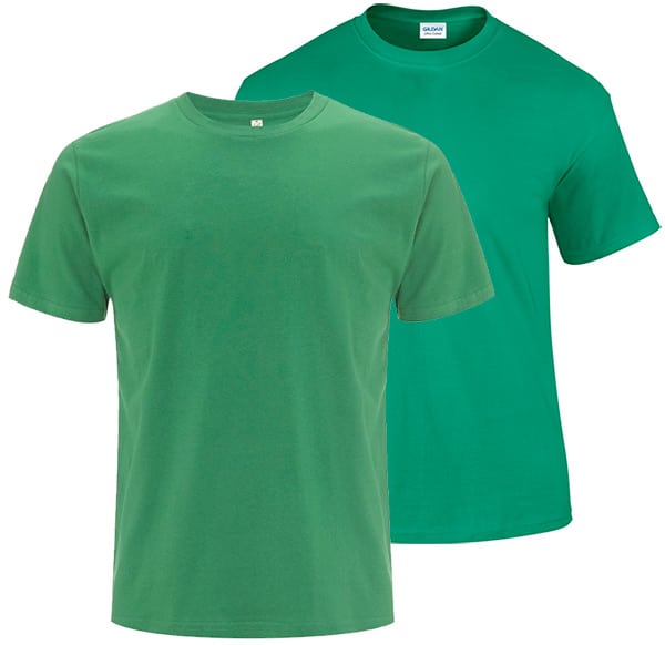
Comparison of Kelly Green across brands.
Subjective Colour Names
When product colours have certain names, you may have expectations for what that colour should look like. But opinions will often differ. This is because names can cover a spectrum of different shades and hues. This is partly why product colours across brands (see above) may not always match. A number of brands use quite specific and/or invented names which helps avoid misinterpretation.
However, there are still colours that some customers have felt to be misleading. Below are a couple of examples, that have cropped up before:
Khaki (Generally)
A source of arguments within our office. It divides brands too. Desert yellow-brown? More like an olive green?
Ecru (EP)
Earth Positive’s Ecru has been found to be yellow-er than customers expect or has been represented online.
Dark Grey (EP)
Earth Positive’s Dark Grey. This grey has a slight green tinge to it, which has been raised by some customers.
It’s always a good idea to request a sample of a product before commiting to it.
Reliability of Website Swatches
Similar to the way brand colours may not be what you expect, website swatches can also be contentious. Swatches are the small blocks or dots on product pages that indicate colour availability. We have found some suppliers, even brands themselves, to have wildly misleading swatches. It’s also not unusual for your own computer monitor colours to misrepresent colours.
Again, we highly recommend getting samples of products or brand swatches. This can avoid you having surprises after committing to a full order. At a minimum, check around online for photographic examples of the product colour. Don’t rely on the web colour swatch alone.
Dye Batches / Discontinuation
Generally, dye batches for a product do not vary over time. However, we cannot guarantee this. If we spot something unfamiliar with a batch with received, we will raise this with you. Although the colour of dye batches usually stay consistent, the process of dying them sometimes varies. This can affect how they discharge (for example if older colour stock has been re-dyed black).
It is possible for brands to discontinue product colours. The frequency of this varies from brand to brand. Certain brands, such as Gildan, tend to stay quite reliable and consistent. Other brands such as Stanley/Stella offer ‘seasonal’ colour range collections. These are ‘on-trend’ colours, and are specific to those seasons and year.
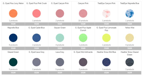
Stanley/Stella – Spring/Summer 2020 Collection
If you want a product with longevity for re-orders, we recommend avoiding seasonal ranges. Once these ranges go, they don’t return. If you have concerns about whether a brand may discontinue a colour, we recommend contacting them directly.
Colour Ranges Available
We try to keep the products listed on our website up to date. However, products can sometimes change before this happens. If you require a particular shade, it’s worth checking availability on the manufacturer’s own website. This will give you the most up to date information on colour availability.
- Beechfield Website
- Continental / Earth Positive Colours
- Gildan Product Colours
- Just Hoods Colour Card
- Stanley/Stella Colour Card
- Westford Mill Website
Please remember, product colour appearance can vary between monitors. As mentioned earlier, swatches aren’t necessarily accurate representations either. It’s a good idea to see a product in your hands before you commit to an order. You can do this by requesting a product sample. Some brands also have physical colour cards available. These allow you to see their full range.