
Low Image Resolution
Low quality / small size raster files are without a doubt the most common print file mistakes we come across (although this doesn’t apply to vectors, as they can be scaled non-destructively).

Original artwork @ 100% Scale
Clean edges and no pixelation. The file has been created at 300dpi and at the dimensions required for printing. A copy of this file can be scaled down for smaller print sizes.
Pixelated artwork @ 100% Scale
Blurred edges and pixel artifacts. This means images intended for web use are not likely to be suitable, or that have already been downloaded from sites like Facebook.
How to Fix: Ensure you are working with the high resolution file.
Artwork for print should always be:
- The dimensions you want it printed
- At least 300dpi
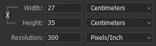
To print a design 27cm x 35cm, it should look like this in Photoshop at the creation stage.
This should be done at the beginning of the artwork creation process – if you try to scale up an existing raster file, the quality will have already been lost.
Note: Also be careful where you upload/download your image files from. Sites like Facebook will compress your images, resulting in a loss of quality. It’s best to email the original artwork directly to us, or using a website like WeTransfer. See our page on sending large files for more info.
Broken Fonts
This will happen when supplying artwork where the text has not yet been either outlined (vectors) or rasterized (raster art). The text tries to re-access the font, because it thinks it is installed on the computer. If it doesn’t exist on our computer, it breaks the link and the software has to substitute it.
The examples below are the same file – the first image did not have the text outlined.
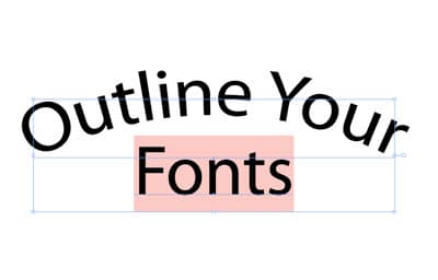
Font incorrectly prepared. This is how we see it.

This is the same font, but correctly outlined.
How To Fix: Check out our page on acceptable file formats for how to outline or rasterize your text.
Text Typos
The easiest of print file mistakes to make, and a potentially expensive one to fix if not caught before production. We always try to watch out for spelling and raise it if we have any doubts. However, naturally customers quite often present us with intentional, unfamiliar spelling variations or made-up words (such as brand names, etc). Therefore, we cannot always reliably flag these, as to us they often appear intentional.
How To Fix: We cannot stress enough how important it is for you to check all spelling.
Poor Quality Scans
If you’re looking to screen print a drawing you’ve created on paper and aren’t intending to modify it digital, it’s still important to make sure the file is correctly prepared. Due to the nature of scanned art, we will assume that we are printing everything exactly as supplied. We aren’t in a position to know what is intentional/unintentional, so we will also assume this for stray marks, smudges, hand written text, etc.
How to Fix: It’s important to ‘touch up’ your scanned artwork before sending it to us. Things to watch for include: stray marks (from pencils, rubber usage), smudges, wonky / blurry text and dirt/dust from scanner. You should make sure that the background around the design is completely white (#FFFFFF) or transparent. Any slightly off-white background areas that are left in the artwork, could distort the artwork or even potentially carry over to the final print.
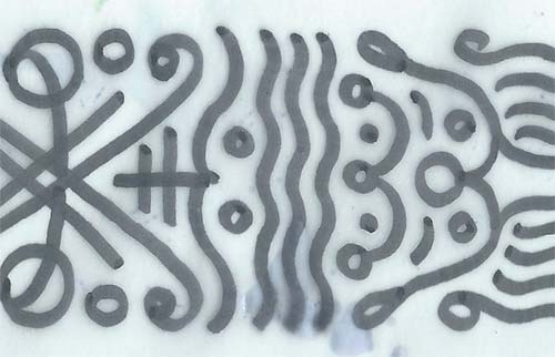
Unprepared scan
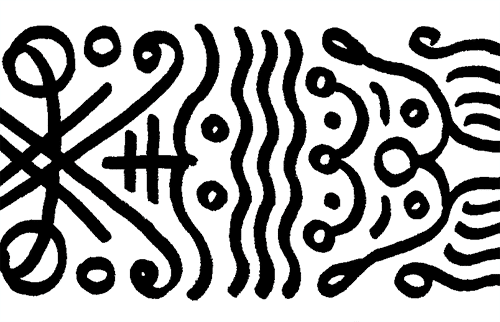
Cleaned up scan
Halftones That Are Too Fine
If you provide your artwork with your own halftones incorporated, it’s important that the halftone is suitable for printing. There are two ways a halftone can end up too fine – either the halftone is created too small to start with, or a halftone is applied to an image that is too big. If an image is too big and requires scaling down to print size, then the halftone details will become smaller/finer. This is another reason to make sure you create artwork at the size you would like it printed, before applying the halftone.
How To Fix: Generally, we recommend providing a copy of your artwork before applying the halftone and another copy after applying it. This way we can see how it should look, but gives us an opportunity to adjust the halftone if we think it needs modifying.
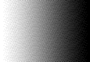
A halftone too fine or reduced by scaling may fill in.
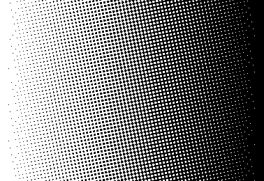
Lower dot frequency reduces unexpected results.
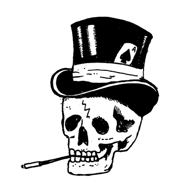
Inverted Highlights/Shadows
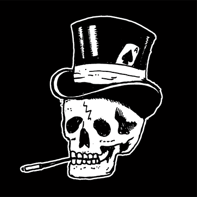
When supplying artwork, you may want to have the same design printed both as dark ink on light garments and also light ink on dark garments. While this can work fine with certain designs (most logos or solid colour designs), other designs which include elements that represent lighting or shadows may look strange. This is because when using the same screen, the design is essentially inverted. The ‘lit’ areas become shadows, and those previous shadows become highlights. Similar to shining a torch upwards into your face (see the middle image below).
How To Fix: In order to avoid this, you need an alternate version of the design. In this version, the ink is printed in areas which were previously negative space / shirt colour. Adding a keyline can also help ensure elements aren’t ‘lost’, if they rely on the garment colour (see the black top hat below).
Initial Screen Using Black Ink
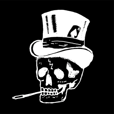
Initial Screen Using White Ink
Additional Screen for White Ink
Skull from Tattoo Tee Sample Store design, created by Jimpwasere.
Altering Artwork On Your Behalf
We prefer art to be ready in advance, however we can make minor changes and fix some print file mistakes on your behalf. We generally charge for this at a fee of £30/hour, starting at £15.
Changes We Can Make
- Simple colour changes or removal
- Rearranging supplied logos
- Simple colour changes
- Resolving certain print file mistakes (upscaling and others on this page)
If supplying logos, you must make sure they are all of a usable quality for print.
We do not charge for separating artwork for print, nor do we advise you trying to separate it for us in preparation. This tends to just add complications and increase turnaround time. Saving the artwork as a complete piece (layers are fine and sometimes useful) at the size you require it printed, is generally all we need. Supplying a mockup for us to use as a visual guide can be helpful too.
If you’d like us to look at your artwork to see if it is suitable for printing, feel free to email it over and we will happily check it for you. You made need to use a site like WeTransfer if they are large file sizes.